

Your wall color is doing something to your brain right now, whether you chose it intentionally or not. The role of color palette in a home office goes well beyond aesthetics: it directly regulates cognitive load, signals work mode to your brain, and either supports or undermines your focus over the course of a full workday. Research confirms that chromatic wall schemes significantly influence both productivity and emotional state in workspace environments. Get the palette right, and your office works with you. Get it wrong, and you’re fighting low-level visual fatigue you’ll probably blame on your screen.
Here’s what the science actually shows:
- Cool, desaturated tones like muted blue and sage green reduce visual cortex stimulation, freeing cognitive bandwidth for sustained focus.
- Warm, muted tones like terracotta and warm beige create an inviting, grounding atmosphere that supports creative thinking.
- A distinct color palette acts as a psychological boundary, cueing your brain that this room has a specific purpose.
- Proper color selection reduces visual fatigue, which compounds into meaningfully different output over a full workday.
- Saturation level matters more than hue. A vivid blue overstimulates just as much as a vivid red.
What are the best paint colors for home office productivity?
Color psychology in workspace design has moved well past “paint it blue and focus better.” The real question is which specific tones, at which saturation levels, actually hold up across an eight-hour day.
Muted blue is the most consistently supported choice for deep, analytical work. A VR-based study with 60 participants found that blue wall schemes produced higher positive affect, primarily through a sense of calm, compared to red and green conditions. Stick to grayed or dusty blues rather than saturated navy on all four walls.
Soft sage green earns its reputation for long-session comfort. It reflects light gently, reduces eye strain, and connects visually to the outdoors, which matters for stress regulation. Pair it with warm wood tones and you get a palette that feels considered rather than clinical.
Warm beige and off-white are underrated workhorses. They keep the room neutral without the harshness of pure white, and they photograph well on video calls. The key is choosing a beige with warm undertones rather than a cool gray-beige that can read as muddy under artificial light.
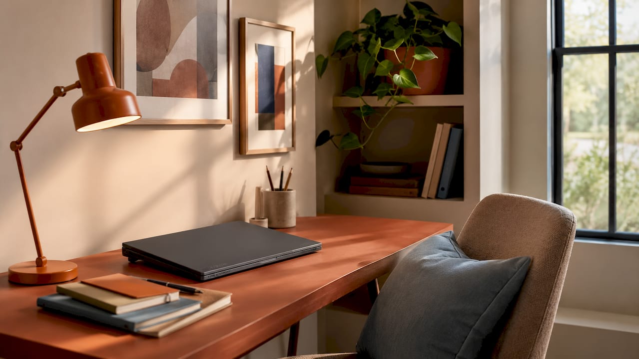
Terracotta and muted coral work best as accent colors rather than dominant wall tones. They add energy and warmth without the anxiety response that saturated red triggers. A terracotta accent wall behind a bookcase, paired with a sage or warm gray primary wall, gives you creative stimulation without overstimulation.
Subdued yellow is worth considering for brainstorming-heavy work. The same VR study found yellow wall schemes drove higher positive affect through feelings of happiness and calmness. The caveat: keep saturation low. A muted ochre reads as warm and energizing; a bright lemon yellow reads as noise.
Some palette combinations that hold up well in practice:
- Navy + coral accent: focus and creative energy in the same room
- Sage green + blush: calm during high-pressure days
- Charcoal + warm mustard accent: grounded with a controlled energy boost
- Warm gray + dusty blue: clean, screen-friendly, and easy to live with
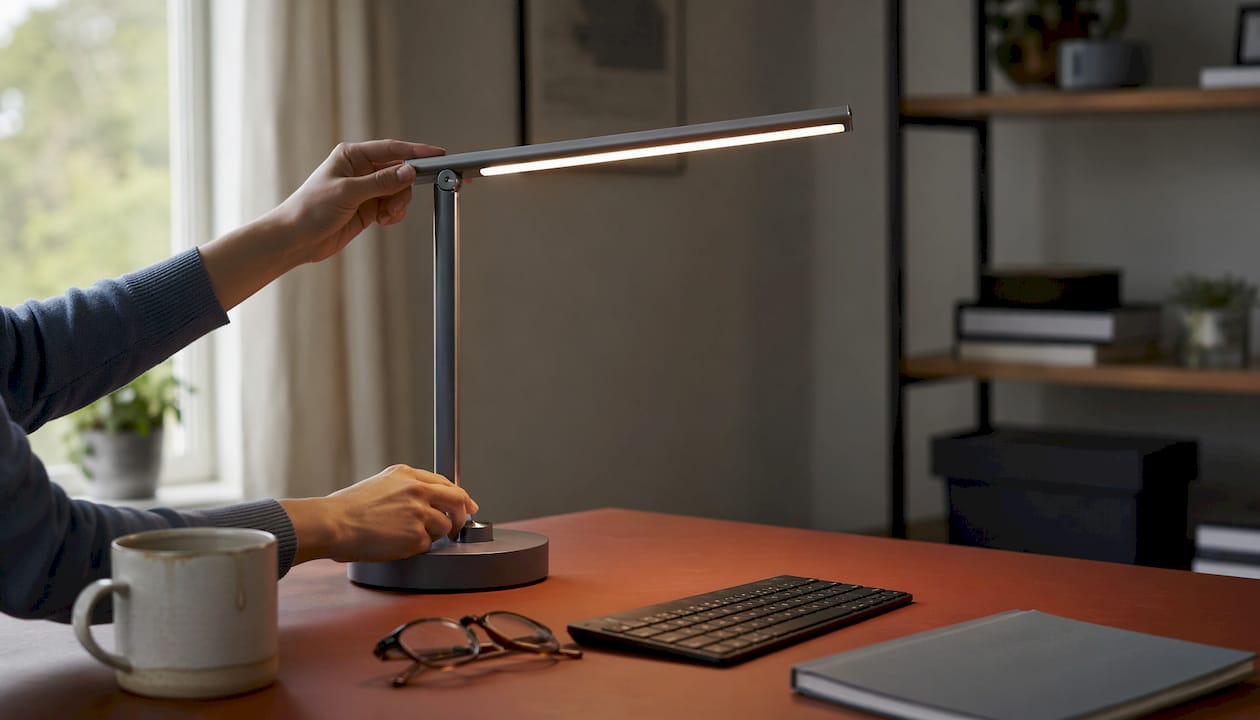
Pro Tip: Smart tunable lighting lets a single static paint color shift between warm and cool tones throughout the day, effectively giving you two palettes without a second coat of paint. Set cooler light temperatures (around 4000K) during deep work hours and warmer tones (2700K) for late afternoon when you need comfort over intensity.
How do you choose the right color palette for your home office?
The single biggest mistake people make is choosing a paint color from a chip or a photo. Colors behave differently under varying light spectra, and a soft warm gray that looks sophisticated in a showroom can read as muddy brown under a 2700K LED. Test paint swatches on poster boards in your actual room, at different times of day, under the lighting you actually work in.
Room orientation shapes everything. North-facing offices receive cooler, more diffuse light all day, which means warm tones like creamy whites or pale peach prevent the room from feeling cold. South-facing rooms get abundant warm light and can handle cooler or slightly deeper tones without losing brightness. East-facing rooms glow in the morning and benefit from soft, fresh colors; west-facing rooms get intense afternoon sun, so muted neutrals or cooler tones keep the space from feeling overwhelming by 4 PM.
Balancing cool and warm tones within a palette prevents visual tension. A room that mixes a cool blue wall with warm terracotta furniture and a cold white ceiling pulls the eye in competing directions. Choose a dominant temperature and let the secondary tones complement rather than fight it.
The 60-30-10 rule gives you a reliable structure: 60% dominant color (walls, large rug), 30% secondary color (desk, shelving, curtains), 10% accent (art, plants, lamp). Limiting your palette to three or four colors keeps the room from reading as chaotic. For dual-purpose spaces, color zoning with an accent wall behind the desk creates a visual boundary between work and living areas without a full repaint.
- Test swatches in the actual room under working light, not just natural light.
- Match your dominant tone temperature to your room’s natural light direction.
- Use the 60-30-10 rule to structure your palette before buying paint.
- Limit the total palette to three or four colors to avoid visual chaos.
- Keep cool and warm tones on the same side of the temperature spectrum.
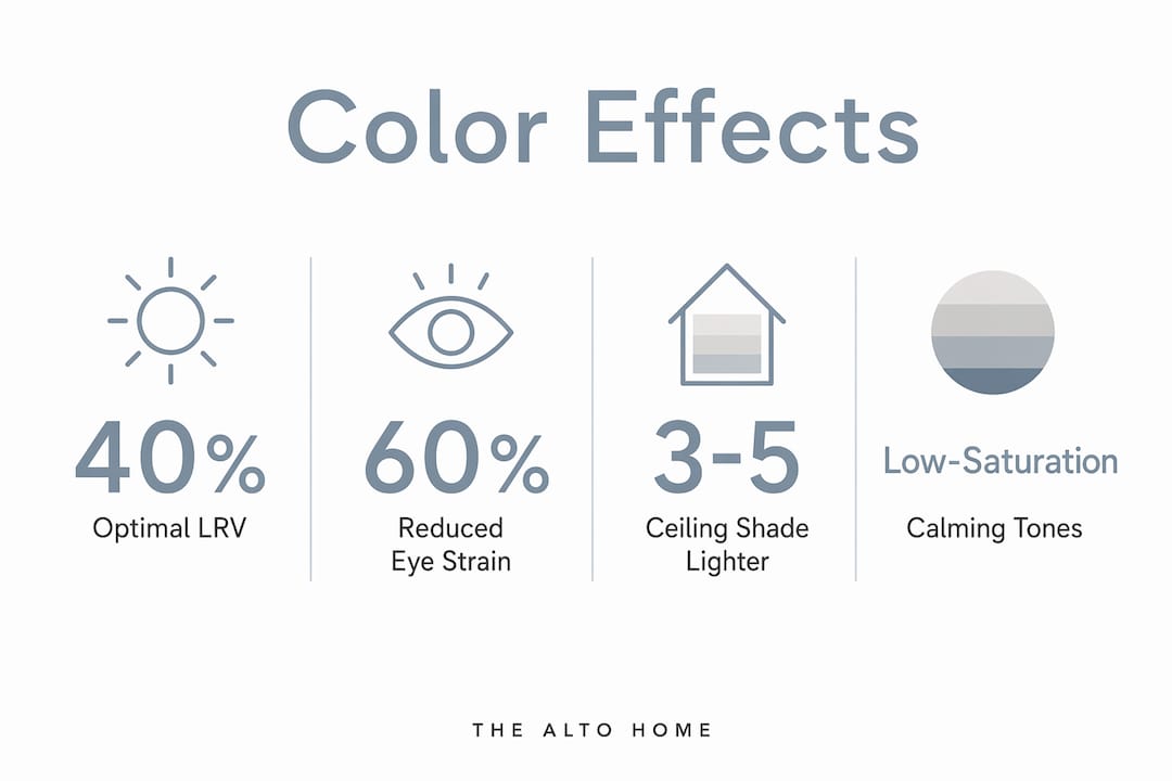
Pro Tip: Paint your ceiling a shade that sits 3–5 LRV points lighter than your walls rather than defaulting to stark white. A ceiling color that harmonizes with the walls creates an envelope-like visual environment that reduces mental fatigue over long work sessions.
What does science say about color, cognitive load, and eye strain?
Color’s effect on the brain is not subtle, and the mechanism is more specific than “blue is calming.” Desaturated, muted colors reduce the background stimulation the visual cortex processes continuously, freeing more cognitive bandwidth for actual work. Highly saturated colors keep the brain’s arousal system slightly elevated, which adds to total cognitive load in a room where you’re already allocating significant mental resources to analytical tasks.
Light reflectance value (LRV) is the other variable most people ignore. Walls with an LRV between 40% and 60% minimize screen glare by up to 75%, reducing the eye strain that accumulates over long work hours. When the wall surrounding your monitor is very dark (LRV below 30), your eyes continuously adjust between the bright screen and the dark surround, producing the headaches and concentration drift many remote workers attribute to screen time alone.
A randomized controlled trial involving 120 high-stress employees found that offices renovated with low-saturation blue-green walls produced a 23.4% rise in job satisfaction scores and a measurable drop in cortisol at 4 weeks, compared to control offices with conventional gray-white tones. The mechanism: blue-green environments stimulate parasympathetic activity, and low-saturation colors reduce visual cognitive load, promoting psychological restoration.
Pure white walls create what eye specialists call “digital bounce back,” where high-reflectance surfaces amplify screen glare and increase eye fatigue. A warm off-white or a light gray with blue undertones at an LRV in the 40–60% range solves this without making the room feel dim. Cultural background also shapes color perception through symbolic associations, which means the “right” color for focus is not universal. A tone that reads as calm and professional in one cultural context may carry different associations in another, something worth factoring in if your work involves frequent video calls with international colleagues.
Top colors to use and how to put them to work
The best home office color schemes share three traits: muted saturation, an LRV in the productive middle range, and a clear relationship to the room’s lighting conditions. Here’s a practical summary of the top performers and how to deploy them.
- Muted blue or blue-gray: Best for deep work and analysis. Use as the dominant wall color in north or east-facing rooms. Pair with warm wood furniture to prevent the room from reading as cold.
- Soft sage green: Ideal for long sessions and creative work. Works in most orientations. Complements natural materials like linen, rattan, and light oak.
- Warm beige or off-white: The most versatile base. Keeps the room screen-friendly and video-call ready. Avoid cool-toned beiges that shift muddy under warm LED light.
- Terracotta or muted coral: Use as an accent wall or in furnishings, not as a dominant wall color. Adds warmth and creative energy without the anxiety response of saturated red.
- Subdued yellow or ochre: Best as a 10% accent, a lamp, a desk accessory, or a single framed print. Provides an energy lift during afternoon focus slumps.
- Charcoal or deep navy: Effective as a single focus wall behind the desk. Creates a “focus cave” effect that defines the work zone without closing off the room.
Accent colors do specific jobs. A yellow desk lamp in a sage-green room provides a gentle energy cue without disrupting the room’s dominant calm. A terracotta cushion on a charcoal chair adds warmth without shifting the room’s temperature. Think of accents as tools for micro-adjustments to mood, not decoration for its own sake.
Pair your color choices with ergonomic furniture that complements the palette. A warm-toned desk in a cool-blue room creates the kind of intentional contrast that feels designed rather than accidental. Test, adjust, and give yourself at least two weeks before deciding a color isn’t working. The brain adapts to new environments, and first impressions of a fresh paint job are not always reliable indicators of long-term performance.
Pro Tip: Combine your color palette with a height-adjustable desk to reinforce the psychological boundary between work and rest. Physical transitions, like standing up, paired with a visually distinct workspace, strengthen the environmental cues that help your brain shift into and out of focus mode.
Bring it all together with the right workspace
Color sets the stage, but the furniture you place in that space either reinforces or undermines the whole effect. The Alto Home’s standing desks are built specifically for this kind of intentional workspace design. The Gramercy Fluted Wood Standing Desk pairs naturally with sage, warm gray, and terracotta palettes, its warm wood finish adding the organic contrast that keeps a cool-toned room from feeling sterile. The Tribeca Mid-Century Wood Standing Desk suits deeper, richer palettes like charcoal and navy, where its clean lines and warm wood grain read as a deliberate focal point.
Both desks feature adjustable heights, which means the physical act of transitioning from seated to standing reinforces the same psychological boundary your color palette is already creating. For a full picture of how color, light, and furniture work together, The Alto Home’s vibrant color palette guide is worth a read before you commit to swatches.
Key Takeaways
Color palette choices in a home office directly regulate cognitive load, eye strain, and mood, making saturation level and LRV as important as hue selection.
| Point | Details |
|---|---|
| Saturation beats hue | Muted, desaturated tones reduce cognitive load better than vivid colors, regardless of the specific hue. |
| LRV targets eye comfort | Walls with an LRV between 40% and 60% cut screen glare by up to 75%, reducing eye strain during long sessions. |
| Biophilic colors lift output | Nature-inspired color schemes can improve productivity by up to 15% compared to conventional gray-white tones. |
| Test in real conditions | Always evaluate paint swatches in your actual room under working light, not in a store or from a photo. |
| Ceiling color matters | A ceiling painted 3–5 LRV points lighter than the walls reduces mental fatigue compared to a stark white overhead plane. |
